
This is episode 32 of the series looking at the artwork on Bob Dylan albums, with as many illustrations of pictures used and unused on the album. An index of the whole series can be found under the Album Artwork index which is listed at the top of the screen. I am also glad to say that Patrick has been added to our Untold Authors page. Tony
Blonde On Blonde…
by Patrick Roefflaer
- Released: (probably) June 20, 1966
- Photographer: Jerry Schatzberg
- Art-director: John Berg
The photographer
In the mid Sixties Jerry (his mom called him Jerold) Schatzberg was a freelance photographer in New York. His speciality was portraying beautiful, well-dressed women for glamor magazines such as Vogue, Life, Town and Country and Esquire. Thanks to the recommendation of some of these models, he got interested in Bob Dylan and made the photo for one of rock’s first double albums.
“People kept telling me I should meet him,” the photographer, recounted aged 91 in 2018. “I knew Sara first, when she was Sara Lowndes. Sara was telling me about him. I remember being at her apartment overlooking the village and she would point out where Dylan was playing. I didn’t know Dylan, or his music at that time.
“The other person that kept telling me about Dylan was Nico, who went on to sing with the Velvet Underground, of course. Everywhere I’d see her, whether in Paris or London or New York, Nico would mention Dylan, “You gotta see Dylan…you gotta hear Dylan.” Finally I did and of course once I heard him, I loved him.”
However, it took some time before he actually met Dylan. “I don’t remember the occasion,” the photographer said, “but not long after that, Al Aronowitz [the rock journalist famous for introducing Dylan to the Beatles] and a disc jockey named Scott Ross [a “left-wing Jesus freak,” according to Aronowitz, and now a TV host on Pat Robertson’s Christian Broadcasting Network] were in my studio. They had been with Dylan the day before, and out of the blue I said, “Hey, next time you see him, tell him I’d like to photograph him.”
“The next day I get a call from my old friend Sara, who was living with Dylan at that point, and she says, “Bobby hears you want to photograph him.” She gave me the address of the studio where he was recording, and off I went.”
“I was assured that I could photograph him freely,” he adds.
That was August 1965, and Dylan was recording the songs for Highway 61 Revisited in the Columbia studio on Seventh Avenue.
“He greeted me like an old friend,” says Schatzberg. “Immediately he wanted me to listen to what they just recorded. I did and was a little inhibited, but he was very friendly from the very beginning. I wish I could remember what song they were working on that day. I think it was a song about a guy, definitely an ‘up’ tune.” (In another interview however he mentions ‘Desolation Row’ – although not exactly “a song about a guy”).
 “I just sort of got myself in a discreet place and did what I could. I got photographs of him writing, singing, of him just relaxing, playing the piano…. I think I got some very interesting photographs.”
Dylan agreed to a follow up session. In order to have more control over the situation, Schatzberg invited him to his photo studio, at 335 Park Avenue South. There Jerry experienced firsthand that the singer always followed his instincts. “We were doing a lot of pictures and I wanted something of a change. So I went up to my flat and I brought down a couple of shirts, a turtleneck and another shirt, and I asked him to put it on.”
The photographer took a roll of film of Dylan in the new outfit, but then the singer said, “No, no, no — it’s not me. It’s not mine.”

1965, New York, New York, USA — Bob Dylan Posing by Brick Wall — Image by © Jerry Schatzberg/Corbis
“He wasn’t thinking that way; he’s just thinking that’s not him. Because in those days, he was really a pace-setter in style. Everyone was looking at Dylan — wanted to have the same polka-dot shirts as he had, in the same color as he had, and stuff like that.”
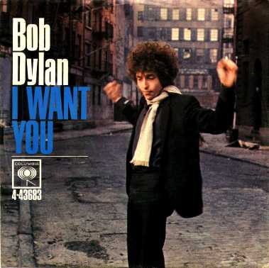
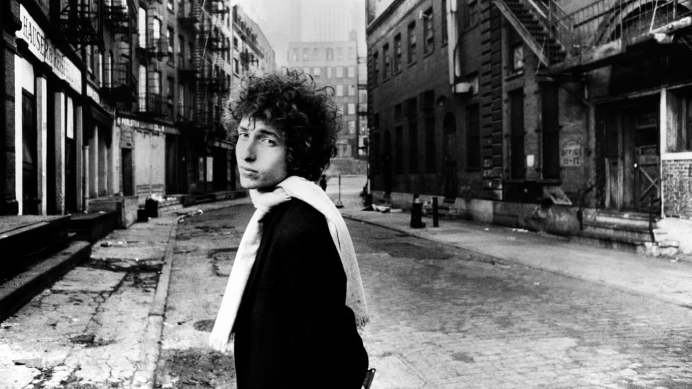
Schatzberg got another chance, some months later, when an image was commissioned by The Saturday Evening Post for a piece they planned on Dylan, to be published coinciding with the release of his next album. The photographer decided to try a change in scenery. “I took him near the Brooklyn Bridge for it. I liked shooting in downtown Manhattan.”
With an abandoned factory building on Jacobs Street as background, Dylan is portrayed wearing a white scarf. With the difficulty of trying to finish the album however, the photos were not used until Summer 1966. In June one of them was chosen for the cover of the ‘I Want You’ single, while another was used as planned on the cover of the Saturday Evening Post on July 30. Those were both in color. A black and white print also appeared on the inside cover of Blonde On Blonde and in 2018 the photographer chose a photo of the session for the cover of his book Dylan by Schatzberg.
Dylan was so pleased with the results that he asked Schatzberg to take the picture for the cover of the album.
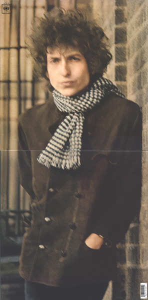
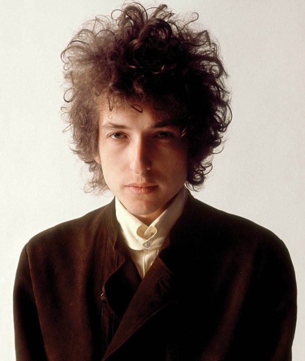
On January 28, 1966, they met again in the photo studio. Dylan was wearing a fashionable yellow shirt, a short brown leather vest and black-gray striped trousers. He posed in front of the photographer’s lens with a number of objects present there: a large Zippo lighter, a cross, a bunch of keys, a book about Flemish painters … But the most successful is a series of black and white portraits of Dylan smoking a cigarette. One of these, with Dylan blowing out the smoke, is considered as the cover photo.
 You can see the photos at Bob Dylan – Jerry Schatzberg Sessions New York.
However, the singer is not completely convinced. Schatzberg agrees: “None of the pictures I was getting in my studio were all that special. They were good, soulful, but I didn’t feel that any of them would make an album cover.
I wanted an interesting location – outside the studio. I remembered going to the Meatpacking District with my parents when I was a kid, and I always thought it was a really interesting part of town. So I asked Bobby if he wanted to go there to take some pictures, and he was all for it—even though it was early February and he only had a jacket and a scarf. I could have put on a heavy coat, but he was in his little jacket, and for some reason I figured I should be in my little jacket, too.”
 At 375 West Street in Morton Street, they stop outside Brooks Transportation Co. They get out of the car, quickly take some pictures and within 30 minutes they’re back in the car. “It was freezing and I was very cold. […] We were both out there shivering. We were joking, having fun. I have one photograph with a smile but I don’t like it as much; I like the serious, soulful ones. I was able to keep the camera steady through most of the sitting but there were four or five images that were out of focus.
It turns out he liked the blurry ones and chose one for the cover. I thought the record label would never go for it, but Dylan had a lot of sway by then and could make those decisions. I just loved it. […] Obviously, everyone was guessing as to what it meant: that it was supposed to suggest he was high or tripping on LSD. None of that. We were just cold and both were shaking. There were other photos that were sharp and focused, but – credit where credit is due – Dylan chose this photo.”
The design
Dylan confronts art director John Berg with a problem: he has recorded so much material that it takes two vinyl discs. The phenomenon of a double LP is completely new. Coincidentally, another record company has the same problem with Freak Out! from The Mothers of Invention (an album produced by Tom Wilson – Bob Dylan’s former producer). Jack Anesh, the art director of Verve / MGM solves it by just putting the records in a single sleeve.
Berg, however, comes up with the idea of making a flip cover – a totally new concept. In 2007, the art director sheds light on his contribution: “We worked from that image [the photo chosen by Dylan] – as opposed to a total concept. So the cropping and the font was our contribution. I shaped the Blonde on Blonde cover so you could close it. That gave us an interesting rectangular / vertical photo instead of the standard square format.”
 He fills the rectangle, with a ratio of one to two, by turning the portrait of Dylan 90°. The great thing, however, is that when the cover is closed, the whole thing can be positioned so that Dylan’s head and torso stand upright when the LP is presented in the window of a record store. This is especially important because it is the only information a potential customer will see: neither Dylan’s name nor the title of the album are printed on the cover of the cover. That’s probably precisely because of the double way in which the cover can be presented.
However, the title and name are indicated in small letters on the fold in the middle of the portrait. After all, that spine remains visible when the LP is in a rack between other albums. “I think that was the first time something like this happened for an LP,” Berg says proudly. “Of course the plates were in danger of falling out, but it looked good.”
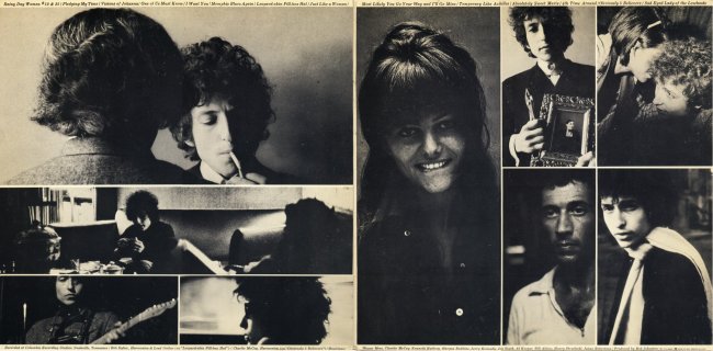
On the inside of the flip cover, Berg arranges nine black and white photos. They were chosen by Dylan from Schatzberg’s portfolio. “At that time, whatever Dylan would send to the record companies, they would use,“ the photographer explains, “He picked all the inside photographs also. They were lying around my studio and he chose them. He picked the self-portrait of me and put it in there. He never said a word about it – he just took it. I don’t get a written credit on the album, which suits me just fine. That’s the way he is. […] We’ve never discussed it, even till this day and I think it’s his way of saying ‘thank you.”
As mentioned, the photo on the lower right, of Dylan wearing the white scarf, is one from the original session on Jacob Street, which inspired the cover. On another we see the back of manager Albert Grossman’s head.
On the first printing, a portrait of Claudia Cardinale is shown, but after her agent objected to the use of her image without her permission, the inner sleeve is changed to leave seven photos.
The photo of a woman whispering something in Dylan’s ear is another that disappeared. It’s Carole Adler, the daughter of harmonica player Lou Adler.
John Berg and Jerry Schatzberg rightly receive a Grammy award for the iconic cover.
The title
 Like the blurry photo, the mysterious title Blonde on Blonde is food for speculation.
Why has the English spelling been used instead of the American “blond”? And what does it mean?
As usual, Dylan’s explanation doesn’t get you any wiser: “I have no idea where that came from, but I’m sure it was with the best of intentions … No idea who came up with it. I certainly didn’t. ”
What is immediately noticeable is that the initials spell Dylan’s first name. This was also the case with Brecht On Brecht, a partly improvised play that Bob attended in the autumn of 1961, on the advice of Suze Rotolo. The piece about Bertold Brecht made a great impression on him.
The most obvious association for blonde on blonde is a duo of lesbian blondes. Or maybe it’s Rolling Stone blonde Brian Jones and his equally blonde girlfriend Anita Pallenberg? Another possibility is a reference to Warhol actress Edie Sedgwick – reportedly an inspiration for many of the songs on the record, but completely absent from the photos – who had her hair bleached. Combine that with Lebanese hashish, also called “blonde” and you get: a blonde with blonde drugs.
More likely, however, is Al Kooper’s story. “We were mixing when (producer) Bob Johnston asked,” What are you going to call it? ” Bob immediately came up with a long series of suggestions: free associations and craziness.”
If we can believe Dylan, the suggestion comes from someone else. This is how we come to a Dutchman: Jan Cremer, the author of the sensational books Ik, Jan Cremer (1964) and Ik, Jan Cremer, tweede boek (1966). Cremer was in New York in the winter of 1965-66 to promote the American edition of his novels.
In 2007 he stated in an interview in the bimonthly cultural magazine Hollands Diep: “On January 10, 1966, I went out to dinner with Bob Dylan, Jayne Mansfield and her manager Irving Arthur. Dylan had read my book and when he heard that he lived right above me at the Chelsea, he immediately came over to buy a painting. He wanted it as an image on the cover of his LP Blonde On Blonde. A very large canvas measuring 1.80 by 2.50 meters. I ended up selling it for $ 8,000, which was a lot of money at the time. […] I also attended the Blonde On Blonde shoot in Nashville. He wanted me to stay with him, but I am independent and I had my own job.” Said canvas would be called “Ode to World Poet Number 1”. Unfortunately I couldn’t find a picture of it.
In an older interview with the Belgian magazine Humo, sometime in the 1970s, Cremer claims to have 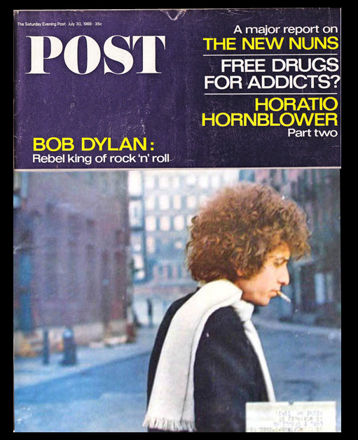 come up with the title. “What rhymes with blonde?” Dylan would have asked. To which our hero: “Why not Blonde On Blonde?”
However, I find none of his claims very credible. Hans Sleutelaar, who, as editor of Cremers work, was in New York, remembers nothing of the so-called friendship. “You cannot take everything Jan wrote for the literal truth, that is not his way of writing either.”
The mystery remains.
Postscript
The photos used for the cover of Bob Dylan Live (1966) and of course The Cutting Edge 1965–1966 (an outtake of the Blonde on Blonde photo session) are also by Jerry Schatzberg.
More photos:
The location: http://www.popspotsnyc.com/blonde_on_blonde/
Outtakes: http://popspotsnyc.com/PIP_BLONDE_on_BLONDE_outtakes/index.html
What else?
You can read about the writers who kindly contribute to Untold Dylan in our About the Authors page.
And you can keep an eye on our current series by checking the listings on the home page
You’ll also find, at the top of this page, and index to some of our series established over the years.
If you have an article or an idea for an article which could be published on Untold Dylan, please do write to Tony@schools.co.uk with the details – or indeed the article itself.
We also have a very lively discussion group “Untold Dylan” on Facebook with getting on for 10,000 members. Just type the phrase “Untold Dylan” in, on your Facebook page or follow this link And because we don’t do political debates on our Facebook group there is a separate group for debating Bob Dylan’s politics – Icicles Hanging Down
Though there may be a tendeny now for Americans to spell the hair colour ‘blond’ and British ‘blonde’ in reference to either sex, the latter as a noun usually refers to the female in both ‘languages’ as in “Gentlman Prefer Blondes”.
* Gentlemen
**tendency
“harmonica player Lou Adler” Do you mean “Larry Adler”.
Larry Adler it should be. Thanks, Mark, for pointing that out.
‘This was also the case with Brecht On Brecht, a partly improvised play that Bob attended in the autumn of 1961, on the advice of Suze Rotolo. The piece about Bertold Brecht made a great impression on him.’
‘Blonde on Blonde’, a message to Suze that this album was about her.
With the direct advantage that all journalists were led astray with the lesbian connotation.