
A complete index to this series looking at the art work of Bob Dylan’s albums can be found here.
by Patrick Roefflaer
- Released: January 17, 1975
- Photographer: Paul Till
- Illustration: David Oppenheim
- Liner Notes: Pete Hamill
- Art-director: Ron Coro
Version 1 – Lithograph by David Oppenheim
 The story of the cover of Dylan’s masterpiece starts in 1973, in France on the tarmac from an Parisian airport.
While boarding a flight to London, a man spots a handsome woman. “She was a classy lady. I did everything to be able to sit next to her.” He is David Oppenheim, an atypical and anarchic painter, born in the south of France.
She is an American businesswoman, Stevie Phillips, artistic representative of stars such as Judy Garland, Robert Redford and Liza Minnelli. There’s a connection between the two and Phillips decides to take advantage of her connections to boost his career.
“After we met, I contacted Dylan through the lawyer we had in common, David Braun. My agency was a big client for David Braun; he couldn’t refuse. I was happy to help David.”
 In September 1974, shortly before the first studio sessions of Blood On the Tracks, Bob Dylan is handed David Oppenheim’s portfolio.
The timing couldn’t be better, as Bob is very interested in painting at the time. In the Spring of 1974 he took a two-month painting course in New York with Norman Raeben. When browsing through the portfolio, he reacts enthusiastically saying, “This guy is my spiritual brother.”
Dylan decides that, once the recordings finished, he wants to go to France, to see how the painter lives and works. In anticipation of that visit, Dylan wants him to make the cover of his new album. It is agreed that the Frenchman will make eight lithographs, from which Dylan can choose. A cheque is sent, “not much, a few thousand francs,” says Oppenheim.
With an eye on the Christmas market, the album is scheduled for rush release November 1st.
In a preview, published in Rolling Stone magazine, Larry ‘Ratso’ Sloman writes: “The scheduled cover is a shot of a huge red rose on a white background. And Dylan was reportedly hunting for old photos of himself performing at Gerde’s Folk City for the back sleeve.”
Version 3 – A photo disguised as a painting
But Dylan changes his mind and lets the record company know that he wants to make new recordings in Minneapolis. The cover design is also being overhauled because, when the record is released in mid-January 1975, it turns out that the cover art in no way fits Sloman’s description.
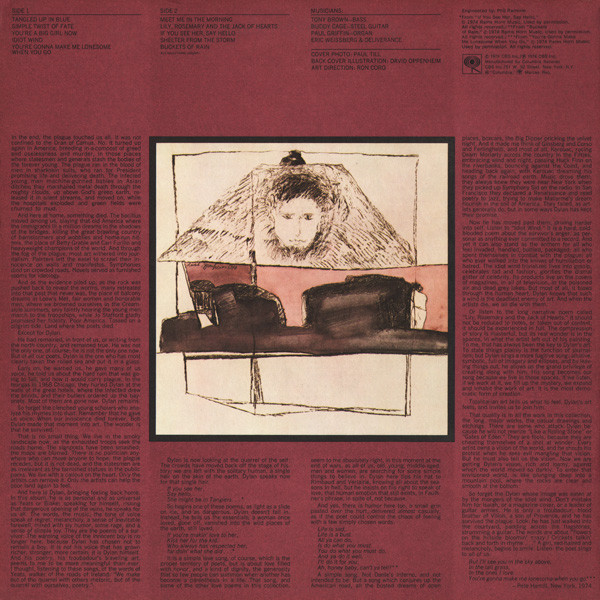
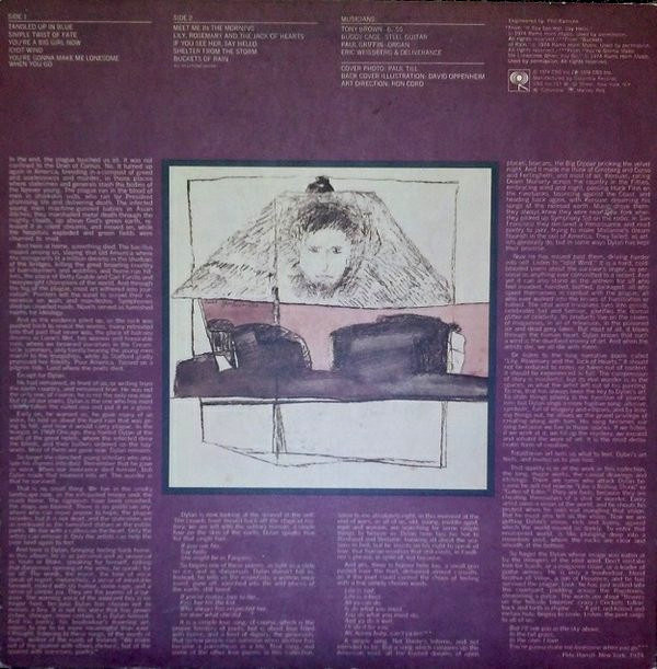
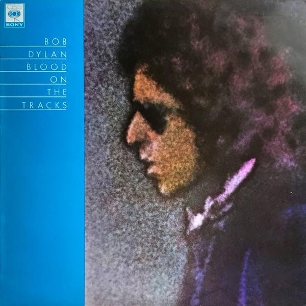
The front shows a portrait of the singer. Dylan looks to the left, wearing dark sunglasses and his signature curly hair. To the left of the portrait, over the full height of the cover, is a broad plum color strip with the singer’s name and the title of the album. Both are in white New Deco font and underlined.
The portrait looks like a painting, but on the back cover is printed: ‘Cover Photo: Paul Till’.
Paul Till is born in England, but in 1957, at the age of three, he emigrated with his parents to Ontario in Canada. As a 20 year-old, he has two interests: music and photography. The first time those hobbies combine is on January 10, 1974, during a Bob Dylan concert in the Maple Leaf Gardens, Toronto. By a happy coincidence (the tickets are distributed by lottery), he secured a fairly good seat: front right, not close to the stage, but also not too far away to get some good pictures, thanks to a borrowed telephoto lens.
With those photos he starts experimenting in his darkroom. In 2008 he explained his technique: ‘I enlarged the negative in my darkroom on another piece of film, so that all I was left with was Dylan’s head. This gives a positive image, so that when printing on photo paper, a negative image appears. However, I solarized the piece of film while it was being developed.’
 In human language: when the exposed photo paper of a black-and-white photo is in the developer, turn the light on and off briefly, so that the photo is fixed. “This not only resulted in the image becoming positive again, but also gave the striking line between what was previously dark and what became dark due to solarization. Technically this is called ‘the Sabbater effect’ and the dark lines are ‘Mackie lines’. It resulted in a rather dark, low-contrast piece of film, with which I could make a print. I had to use paper of excellent quality to get enough contrast.” Till then colors the obtained result manually, with special watercolor. With this he wants to emphasize the old/new discord that he hears in Dylan’s work.
The young man is so pleased with the result that he sends a copy to Dylan’s New York office. He doesn’t get an answer.
He is therefore extremely surprised when his work appears on the cover of Dylan’s new record. “I suspect Bob Dylan saw the photo and thought it was beautiful. But I have no idea if it happened that way.”
Back cover
The back of the cover features one of Oppenheim’s lithographs. This is framed in a wide border of the same plum color used on the front.
The lithograph shows a man’s head, depicted in a kind of worn-out pyramid. This, in turn, appears to be mounted in a frame with two purple surfaces. In front of all that, a black-tinted object floats, with two angular bumps.
At the top, some information is printed in black letters: song titles, musicians (only the original New York musicians are credited, but not those from Minnesota) and some collaborators for the cover art work.
Then there’s also an essay by New York writer and journalist Pete Hamill. He wrote the liner notes after listening to the test pressing, as evidenced by some quotes that deviate from the lyrics on the album.
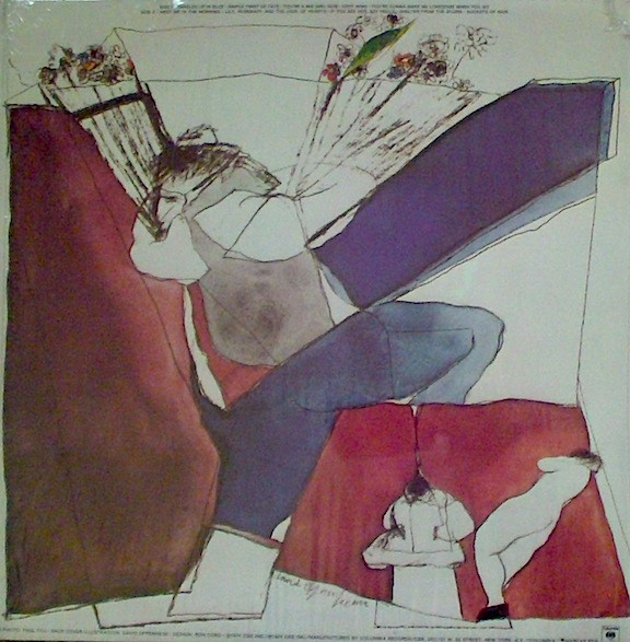
Because that text, due to the additional recordings, is no longer very relevant, Columbia Records released a new back cover for the second American pressing in mid-1975: both Hamill’s text and Oppenheim’s illustration are dropped in favor of another work by Oppenheim, which is printed larger. The new lithograph shows a man stepping over a fence. He has two faces and carries a bouquet of flowers in each hand. Two much smaller figures can be seen on one side: a naked woman and a person seated, engrossed in a newspaper.
It gets a little annoying for the record company when Hamill receives a Grammy Award for the liner notes that have since been removed. CBS is therefore forced to adjust the back cover again. From 1976 the original design is restored, but now with white text (the black letters were difficult to read against the plum background). This remains the standard version until the end of the nineties, when vinyl is replaced by CDs.
All that time, the covers pressed in England, kept the original design unchanged.
Extra information for quiz fanatics
 In Malaysia and the Republic of Singapore, EMI released Blood on the Tracks, with a blue cover.
Since Dylan has moved to Los Angeles in 1973, the covers of his records are no longer handled by the art directors of CBS in New York, under the direction of John Berg, but by the West Coast Art Director Ron Coro.
The full painting back cover actually spells out D Y L A N if you look hard enough. It’s there.
I never heard that. Interesting.
An unfinished pyramid appears on the back of the American one dollar bill.
And likewise on the Great Seal of the United States.