
Shadows in the Night
This article is part of a long-running series which reviews the artwork of Dylan’s albums from the earliest days of his career. An alphabetical index to the albums covered in the series can be found here.
Dylan’s album artwork: Shadows in the Night
by Patrick Roefflaer
- Released: February 3, 2015
- Photographers: William Claxton, John Shearer
- Art-director: Geoff Gans
Front
 When Bob Dylan is confronted with writer’s block, he likes to go back to music that appealed to him as a young man. In the early nineties it was the blues and folk music on Good as I Been to You and World Gone Wrong. Twenty years later, he – like so many before him – flips through the Great American Songbook.
With Frank Sinatra as his guide, he pays tribute to the kind of professional songwriters who saw their glory days come to an end through artists like himself and The Beatles: singers who shifted the norms by seeing it as their right to write their own songs.
To present his first album with this kind of covers, (“Shadows in the Night”), he chooses the formal language of the period just before he himself started as a recording artist: the early sixties. But much cooler than the art work of Sinatra’s albums of that time, is the graphic art of the jazz label Blue Note Records, for which Reid Miles created a series of iconic album covers, often with photographs made by label co-founder Francis Wolff.
 Dylan had worked with Miles Reid before: he was the photographer for The Basement Tapes (1975). But by 2014 both Reid and Wolff were no longer with us.
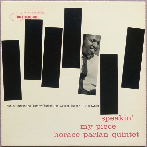
So Geoff Gans, Dylan’s regular art-director since the mid-Nineties, had to come up with making something similar. Gans based his design on a concept of which Reid made three variations for Blue Note.
In July 1960 appeared Speakin’ My Piece an album by The Horace Parlan Quintet. Pictured are seven black bars of equal size on a white background. The bars weave a bit like on a sound wave. The third bar from the right shows a black and white photo of the leader of the five – a photo by Francis Wolff. The lettering is in red.
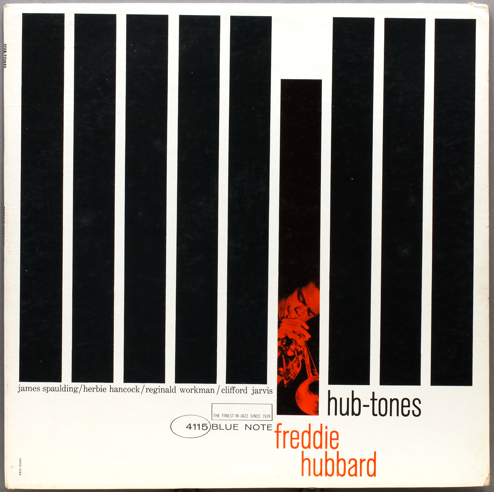
Reid improved this design two years later for Hub-Tones, an album by jazz trumpeter Freddie Hubbard, released in October 1962. Again the backdrop is white, and the bars are black. This time there are nine of them, all vertical and all the same size. This time it’s the fourth bar from the right that show the red tinted photograph.
This bar is dropped down slightly, like a depressed piano key, to make it stand out. Simple, yet perfect.
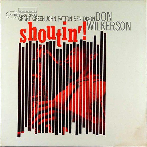 Less than ten months later, Reid used a third variation on the same concept for Shoutin’ by Don Wilinson (July 1963). Again the colour scheme remains white, black and red. This time the vertical black bars are much smaller, as there are 24 of them.
Now they seem to be following the shapes of the lettering of the name of the album: shoutin’. Again there’s a red tinted black and white photograph of the saxophonist, but this time it is spread across all the bars.
Bob Dylan.
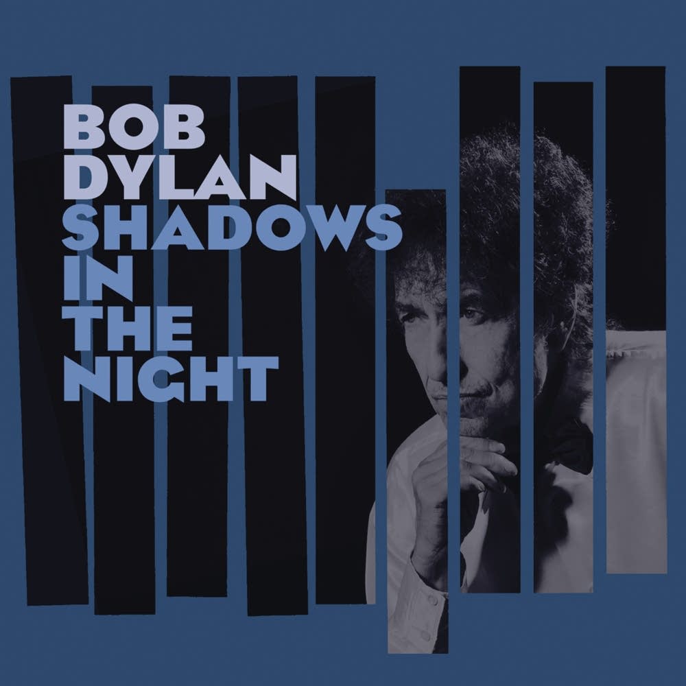
Geoff Gans took the overall look of the Freddie Hubbard album: nine vertical bars, of which the fourth from the right is dropped down slightly.
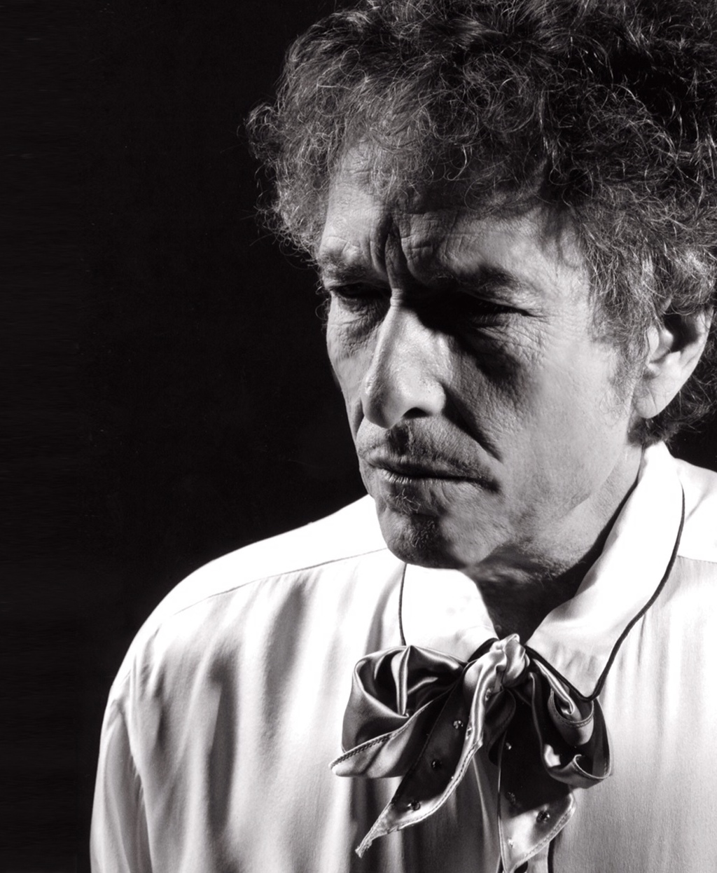
From the Don Wilinson album he used the idea to place a black and white photograph of Dylan in a thoughtful pose, coming through the bars. Instead of a white background, Gans used a blue filter over both the background and the photograph.
Although, in the minimal credits featured on the package, only John Shearer is mentioned as photographer, the formal attire and general look of the used portrait strongly reminds of other photos William Claxton had made of Bob Dylan almost a decade earlier.
William Claxton was best known as a photographer of jazz musicians and movie stars in the fifties (Frank Sinatra, Chet Baker…). One of his last assignments was for Dylan: portraits used for Modern Times (2006) and Tell Tale Signs (Rare And Unreleased 1989-2006) (2008).
The photographer died in 2008 at the age of 81.
For the title and name, Gans lets go of miles Reid’s visual language. Instead of the small font, often in lower-case letters as used by Reid, Gans opts for large capital letters. The font he uses is Eagle Bold, designed by Morris Fuller Benton and introduced by American Type Founders in 1934. These letters are also printed in blue, with the name Bob Dylan in a lighter shade.
Back
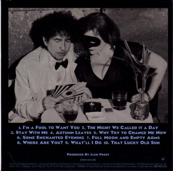 The back sleeve is mostly filled with a large black and white photograph of Bob Dylan and a masked woman.
They are sitting at a small nightclub table, dressed in their finest clothes, and looking at a 7” single. Not, as you might expect something by Frank Sinatra, but a Sun record!
To be precise (based on the larger version of the photo and the newly designed sleeve), it is identified as Johnny Cash’s ‘Get Rhythm’/’I Walk The Line’, re-released by Jack White’s Third Man Records on 21 May 2013.
Because of this, some believe that the masked lady could well be Meg White, the former wife of label owner Jack White. But the scene might refer to photos of Sinatra and his then wife, Mia Farrow, wearing masks at Truman Capote’s 1966 Black and White ball.
The photo was taken by John Shearer, who was more or less Dylan’s official photographer between 2012 and 2017. Under the photograph there are the titles of the songs and the people who contributed to the recordings and sleeve design.
The label design for both the CD and album versions is a Blue Note facsimile.
love it! thank you!
however…some clarificar=tion is need on the TOOM story and especially Stipe/REM concert story.
Please do, mr. Gans. I’m all ears.
@ Geoff Gans: I found the info on REM’s gig with a Geoff Gans her: https://remtimeline.com/1987.html