This article is part of a long-running series which reviews the artwork of Dylan’s albums from the earliest days of his career. An alphabetical index to the albums covered in the series can be found here.
Dylan’s album artwork: Planet Waves
by Patrick Roefflaer
- Release January 17, 1974
- Illustrations Bob Dylan
- Liner Notes Bob Dylan
- Art-director Bob Dylan
In September 1973, Bob Dylan signed an album record deal with Elektra/Asylum Records. Because he can no longer use the trusted art directors of Columbia, he decides to design the artwork for the album entirely on his own. There’s not even a photographer involved.
Front
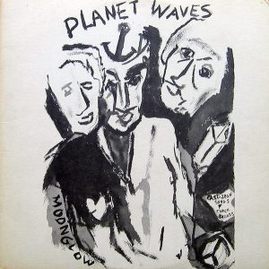
 As for Self Portrait and The Band’s debut album (Music from Big Pink), Bob Dylan makes a painting for the front of the cover. On a white background he places figures and letters, in rough strokes, with black ink (or paint).
The image shows an unknown man, decorated with various attributes: an anchor on his forehead, a pierced heart on his jacket and the word ‘Moonglow’ on his sleeve. Behind the figure are two more men, of which only the faces are depicted. The head of the man on the right is clear, but otherwise he is surrounded by a grey spot.
Three objects are depicted in grey: some kind of crystal, a peace sign and a badge with the words ‘cast iron songs & torch ballads’. Those words may be a characterization of the album, an addition to the title “Planet Waves,” which tops the list. With some goodwill, you can see references to the song “Never Say Goodbye.” In that song, the singer claims that his dreams are made of “iron and steel.” There is also talk of ‘crashing waves’.
A key song perhaps? But one with a fairly vague text.
The name of the performer is missing from the front of the cover. As with the last few albums, nowhere on the front cover is it mentioned that this is a Bob Dylan album.
Since there isn’t even a picture of the singer shown, the record company are worried potential buyers could overlook the release. The solution is to put a sticker on it with ‘Bob Dylan’.
This is done on the plastic in which the album is packed, or even directly on the cover. For the French pressing, someone tries to imitate Dylan’s handwriting to add his name to the title.
Back
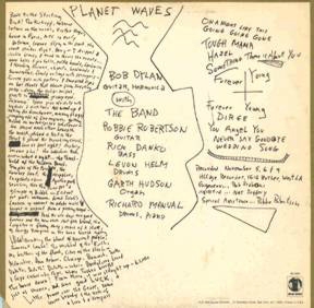
 The back of the cover is also executed with black letters on a white background. Surrounded by a narrow golden border, the white square is roughly divided into three columns using two angular lines.
In the left column is a handwritten text – possibly excerpts from a diary – complete with deletions and typographical errors (‘Buddha’ and ‘echoes’).
In the middle: the title at the top is underlined by three waves, and below that a list of the musicians, with their main instruments. Richard Manuel has been renamed ‘Manual’. A mistake or a joke?
The column on the right shows another list: the song titles, with those of side 1 and side 2 separated by a cross. Below that, some more data is added: location, (some of the) dates of the recordings, plus the names of the technical staff involved.
If the lack of the singer’s name on the front caused some problems for the record company, the back proved to be even more problematic. In the piece of text on the left, there’s talk about ‘big dicks’ and ‘bar stools that stank from sweating pussy’. Of course Asylum’s lawyers objected to the passages that could be considered obscene.
 Deleting the offensive words was apparently not an option and so a compromise is found.
The disc will be sold in a transparent protective cover, with the back of the cover completely hidden behind a golden loose sheet. On that sheet, in white letters, an enlargement of the middle and right columns is shown.
In England, the albums are distributed by another independent record company: Island Records. Someone at the company feels that the extra sheet is easier to read when the colours are reversed: golden letters on a white background.
Rejected designs
Because of all that hassle, the album does not reach the stores in time and the tour has been going on for two weeks when the album finally appears on January 17, 1974. In some articles, it is mentioned that the postponement is due to a late name change of the record. However, this is not evident from the promo copies that have been distributed.
It appears that originally Dylan had indeed designed a different cover, with a painting of a dancer on the front and a photo of himself with a beret on the head on the back.
The record was then titled Ceremonies Of The Horsemen – a quote from ‘Love Minus Zero/No Limit’ of 1965.
In addition, another possible title is mentioned: Love Songs. However, no cover design has surfaced for this.
In 1982, Sony Music (which by then had bought CBS) took over the rights to the album. For the reissue, a new cover design was considered.
The sepia-tinted photo of Dylan with a beret was probably taken by Lynn Goldsmith, in October 1975.
Variants
In addition, there are several variants of the cover, two of which stand out in particular.
In the former Rhodesia (now Zimbabwe) the cover is printed negatively so that both the front and back display white letters and lines against a black background.
The so-called quadraphonic LP pressing, published in 1974 by Asylum, distinguishes itself from the ordinary stereo pressing because the front of the cover is black, with a reduced version of the original cover in the middle.


The rear of the quadraphonic LP sleeve spells Richard Manuel’s surname correctly.